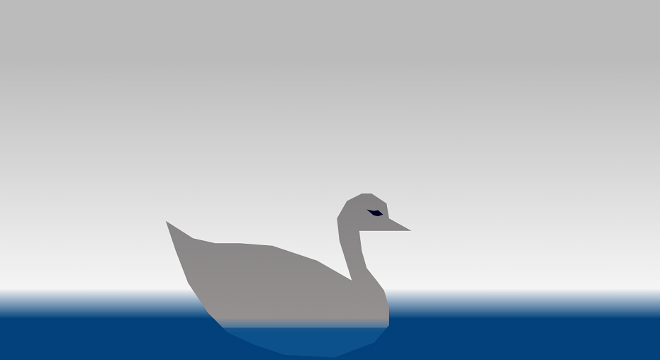
here is a beautiful animation of swan swimming in the sea by using only html and css.
we have made swan here with the help of clip-path property.. see the html code given bellow:
    <body>
        <div class="container-fluid sky">
     <div class="bird">
     </div>
     <div class="sea"></div>
        </div>
    </body>
after that we will see css code for the animation.. we animate swan by @keyframes. this is an awesome css html project to learn about clip-path and transform properties of CSS. see the below CSS code:
        *{
            margin: 0;
            padding: 0;
            box-sizing: border-box;
        }
        .container-fluid.sky{
            width: 100vw;
            height: 100vh;
            background: rgb(186,186,186);
            background: -moz-linear-gradient(180deg, rgba(186,186,186,1) 17%, rgba(245,245,245,1) 78%, rgb(8, 67, 122) 86%);
            background: -webkit-linear-gradient(180deg, rgba(186,186,186,1) 17%, rgba(245,245,245,1) 78%, rgb(8, 67, 122) 86%);
            background: linear-gradient(180deg, rgba(186,186,186,1) 17%, rgba(245,245,245,1) 78%, rgb(8, 67, 122) 86%);
            filter: progid:DXImageTransform.Microsoft.gradient(startColorstr="#bababa",endColorstr="#648daf",GradientType=1);
           animation: sidechange 2s linear infinite;
        }

        .bird{
            position: absolute;
            bottom: 10px;
            left: 50%;
            transform: translateX(-50%);
            width: 42vw;
            height: 42vw;
            background-color: rgb(30, 139, 130);
            clip-path: polygon(84% 30%, 90% 34%, 91% 40%, 100% 45%, 79% 45%, 80% 53%, 82% 60%, 86% 65%, 89% 69%, 91% 76%, 91% 83%, 85% 90%, 69% 96%, 49% 95%, 37% 91%, 26% 86%, 18% 78%, 10% 66%, 5% 53%, 1% 41%, 12% 48%, 21% 50%, 31% 50%, 44% 51%, 62% 57%, 76% 65%, 71% 49%, 70% 40%, 74% 33%, 80% 30%);
            display:inline-block;
          z-index: 0;
          background: rgb(119,119,119);
        background: -moz-linear-gradient(180deg, rgba(119,119,119,1) 0%, rgba(148,144,144,1) 80%, rgba(38,106,162,1) 86%);
        background: -webkit-linear-gradient(180deg, rgba(119,119,119,1) 0%, rgba(148,144,144,1) 80%, rgba(38,106,162,1) 86%);
        background: linear-gradient(180deg, rgba(119,119,119,1) 0%, rgba(148,144,144,1) 80%, rgba(38,106,162,1) 86%);
        filter: progid:DXImageTransform.Microsoft.gradient(startColorstr="#777777",endColorstr="#266aa2",GradientType=1);
        animation: birdneckmove 4s linear infinite;
        }
        .bird::before{
            content:"";
            position:absolute;
            bottom:245px;
            right:40px;
            clip-path: polygon(73% 35%, 63% 29%, 54% 30%, 40% 28%, 54% 36%, 63% 37%);
            width: 10vw;
            height: 12vw;
            background-color: rgb(7, 5, 43);
           z-index: 1;
           color: black;
           animation: birdeye 4s linear infinite;
        }

        .sea{
            width: 100vw;
            height: 7vw;
            position: absolute;
            bottom: 0;
            left: 0;
            background-color: rgb(8, 67, 122);
            opacity: .6;
            animation: seachange 2s linear infinite;
        }
        @keyframes seachange{
            30%{
                height:7.9vw;
            }
            70%{
                height:7vw;
            }
        }

        @keyframes birdneckmove{
            20%{
                clip-path: polygon(84% 30%, 90% 34%, 91% 40%, 100% 45%, 79% 45%, 80% 53%, 82% 60%, 86% 65%, 89% 69%, 91% 76%, 91% 83%, 85% 90%, 69% 96%, 49% 95%, 37% 91%, 26% 86%, 18% 78%, 10% 66%, 5% 53%, 1% 41%, 12% 48%, 21% 50%, 31% 50%, 44% 51%, 62% 57%, 76% 65%, 71% 49%, 70% 40%, 74% 33%, 80% 30%);    }
            50%{
                clip-path: polygon(91% 38%, 93% 46%, 91% 51%, 93% 65%, 84% 52%, 80% 51%, 82% 60%, 86% 65%, 89% 70%, 91% 76%, 91% 83%, 85% 90%, 69% 96%, 49% 95%, 37% 91%, 26% 86%, 18% 78%, 10% 66%, 5% 53%, 1% 41%, 12% 48%, 21% 50%, 31% 50%, 44% 51%, 62% 57%, 76% 65%, 71% 49%, 73% 41%, 79% 35%, 85% 35%);

            }
            90%{
                clip-path: polygon(91% 38%, 93% 46%, 91% 51%, 93% 65%, 84% 52%, 80% 51%, 82% 60%, 86% 65%, 89% 70%, 91% 76%, 91% 83%, 85% 90%, 69% 96%, 49% 95%, 37% 91%, 26% 86%, 18% 78%, 10% 66%, 5% 53%, 1% 41%, 12% 48%, 21% 50%, 31% 50%, 44% 51%, 62% 57%, 76% 65%, 71% 49%, 73% 41%, 79% 35%, 85% 35%);

            }
        }


        @keyframes birdeye{
            20%{
                clip-path: polygon(73% 35%, 63% 29%, 54% 30%, 40% 28%, 54% 36%, 63% 37%);
            }
            50%{
                clip-path: polygon(74% 59%, 63% 50%, 54% 37%, 52% 33%, 57% 44%, 62% 51%);
            }
            90%{
                clip-path: polygon(74% 59%, 63% 50%, 54% 37%, 52% 33%, 57% 44%, 62% 51%);
            }
        }
Copyright2022 me code ant. All Rights Reserved.