here is a beautiful animation of blinking stars by using only html and css.
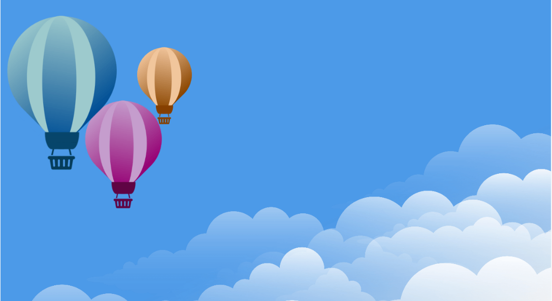
hot air balloons floating peacefully in the blue sky. we are styling div element like a balloon with the help of left-right-top-bottom border radius. easy way to make such animations is to use svg image of balloon, but here we have made balloon with pure css only and used bucket icon as a standing box. this is best project to learn more about css styling. so let's have a balloon ride.. here we have set three balloons with different sizes with class names "balloon_container, balloon_container2 and balloon_container3". "ball_one and ball_two" are span classes for curv design on balloons. see the html code given bellow:
  <div class="balloon_container">
    <div class="balloon">
        <span class="ball_one"></span>
        <span class="ball_two">
     <i class="fa fa-shopping-basket" aria-hidden="true"></i>
        </span>
    </div>
</div>

<div class="balloon_container2">
    <div class="balloon">
        <span class="ball_one"></span>
        <span class="ball_two">
     <i class="fa fa-shopping-basket" aria-hidden="true"></i>
        </span>
    </div>
</div>

<div class="balloon_container3">
    <div class="balloon">
        <span class="ball_one"></span>
        <span class="ball_two">
     <i class="fa fa-shopping-basket" aria-hidden="true"></i>
        </span>
    </div>
</div>
after that we will see css code for the animation. we have using background sky image here downloded from pexels.com.
* {
    margin: 0;
    padding: 0;
    -webkit-box-sizing: border-box;
            box-sizing: border-box;
  }

  .body_one {
    top: 0;
    left: 0;
    overflow: hidden;
    background: url("images/scenetwo.jpg");
    background-size: cover;
  }

  .body_one .my_first {
    width: 100vw;
    height: 100vh;
    position: relative;
    top: 0px;
    left: 20px;
    margin: 0;
    padding: 0;
    background-position: center;
    background-size: cover;
    background-position: top;
 }

  .ballon {
    display: -webkit-inline-box;
    display: -ms-inline-flexbox;
    display: inline-flex;
    position: relative;
    top: 20px;
    min-height: 16em;
    min-width: 16em;
    border-radius: 150%;
    border-bottom-left-radius: 425%;
    border-bottom-right-radius: 425%;
    border-top-left-radius: 425%;
    border-top-right-radius: 50%;
    background: linear-gradient(5deg, #9cc9cc, #014a92);
    -webkit-transform: rotate(135deg);
            transform: rotate(135deg);
    z-index: 2;
  }

 .ballon::before {
   position: absolute;
    top: -25px;
    content: "";
    min-height: 18em;
    min-width: 10em;
    background-color: #9cc9cc;
    border-radius: 50%;
    border-bottom-left-radius: 80%;
    border-bottom-right-radius: 80%;
    border-top-left-radius: 80%;
    border-top-right-radius: 80%;
    left: 60px;
    -webkit-transform: rotate(-135deg);
            transform: rotate(-135deg);
  }

  .ballon::after {
    position: absolute;
    top: -37px;
    content: "";
    min-height: 19em;
    min-width: 5em;
    background: linear-gradient(10deg, #014a92, #9cc9cc);
    border-radius: 50%;
    border-bottom-left-radius: 80%;
    border-bottom-right-radius: 80%;
    border-top-left-radius: 80%;
    border-top-right-radius: 80%;
    left: 110px;
    -webkit-transform: rotate(-135deg);
            transform: rotate(-135deg);
  }

  .ballon .ball_one {
    position: absolute;
    bottom: 60px;
    top: -8px;
    left: 204px;
    right: 450px;
    height: 40px;
    width: 80px;
    border: 3px;
    background-color: #0e476b;
    -webkit-transform: rotate(45deg);
            transform: rotate(45deg);
    z-index: 2;
    border-radius: 50%/100px 100px 0 0;
  }

  .ballon .ball_two {
    -webkit-transform: rotate(-135deg);
            transform: rotate(-135deg);
    position: relative;
    top: -202px;
    left: 300px;
    font-size: 350%;
    color: #0d3e5a;
    z-index: 1;
  }

  .ballon_container {
    -webkit-animation: balloonmove 5s ease-in-out infinite;
            animation: balloonmove 5s ease-in-out infinite;
    position: absolute;
    top: 0;
    padding: 0;
    z-index: 4;
  }

  .ballon_container2 {
   -webkit-animation: balloonmoveone 6s ease-in-out infinite;
            animation: balloonmoveone 6s ease-in-out infinite;
    position: absolute;
    top: 150px;
    left: 150px;
  }

  .ballon_container2 .ballon {
    background: linear-gradient(5deg, #c49ccc, #92016e);
  }

  .ballon_container2 .ballon::before {
    position: absolute;
    top: -25px;
    content: "";
    min-height: 18em;
    min-width: 10em;
    background-color: #c49ccc;
    border-radius: 50%;
    border-bottom-left-radius: 80%;
    border-bottom-right-radius: 80%;
    border-top-left-radius: 80%;
    border-top-right-radius: 80%;
   left: 60px;
    -webkit-transform: rotate(-135deg);
            transform: rotate(-135deg);
  }

  .ballon_container2 .ballon::after {
    position: absolute;
    top: -37px;
    content: "";
    min-height: 19em;
    min-width: 5em;
    background: linear-gradient(10deg, #92016e, #c49ccc);
    border-radius: 50%;
    border-bottom-left-radius: 80%;
    border-bottom-right-radius: 80%;
    border-top-left-radius: 80%;
    border-top-right-radius: 80%;
    left: 110px;
    -webkit-transform: rotate(-135deg);
            transform: rotate(-135deg);
  }

  .ballon_container2 .ball_one {
    background-color: #5f0c46;
  }

  .ballon_container2 .ball_two {
            color: #5f0c46;
          }

  .ballon_container3 {
    -webkit-animation: balloonmovetwo 7s ease infinite;
            animation: balloonmovetwo 7s ease infinite;
    position: absolute;
    top: 0px;
    left: 250px;
  }

  .ballon_container3 .ballon {
    background: linear-gradient(5deg, #f1c59b, #854101);
  }

  .ballon_container3 .ballon::before {
    position: absolute;
    top: -25px;
    content: "";
    min-height: 18em;
    min-width: 10em;
    background-color: #f1c59b;
    border-radius: 50%;
    border-bottom-left-radius: 80%;
    border-bottom-right-radius: 80%;
    border-top-left-radius: 80%;
    border-top-right-radius: 80%;
    left: 60px;
    -webkit-transform: rotate(-135deg);
            transform: rotate(-135deg);
  }

  .ballon_container3 .ballon::after {
    position: absolute;
    top: -37px;
    content: "";
    min-height: 19em;
    min-width: 5em;
    background: linear-gradient(10deg, #854101, #f1c59b);
    border-radius: 50%;
    border-bottom-left-radius: 80%;
    border-bottom-right-radius: 80%;
    border-top-left-radius: 80%;
    border-top-right-radius: 80%;
    left: 110px;
    -webkit-transform: rotate(-135deg);
            transform: rotate(-135deg);
  }

  .ballon_container3 .ball_one {
    background-color: #854101;
  }

  .ballon_container3 .ball_two {
    color: #854101;
  }

  @-webkit-keyframes balloonmove {
    0%, 100% {
      -webkit-transform: translateY(20%);
              transform: translateY(20%);
    }
    50% {
      -webkit-transform: translateY(10%);
              transform: translateY(10%);
    }
  }

  @keyframes balloonmove {
    0%, 100% {
      -webkit-transform: translateY(20%);
                 transform: translateY(20%);
    }
    50% {
      -webkit-transform: translateY(10%);
              transform: translateY(10%);
    }
  }

     @-webkit-keyframes balloonmoveone {
    0%, 100% {
      -webkit-transform: translateY(20%) scale(70%);
              transform: translateY(20%) scale(70%);
    }
    50% {
      -webkit-transform: translateY(10%) scale(70%);
              transform: translateY(10%) scale(70%);
    }
  }

     @keyframes balloonmoveone {
        0%, 100% {
          -webkit-transform: translateY(20%) scale(70%);
                  transform: translateY(20%) scale(70%);
        }
        50% {
          -webkit-transform: translateY(10%) scale(70%);
                  transform: translateY(10%) scale(70%);
    }
  }

  @-webkit-keyframes balloonmovetwo {
    0%, 100% {
      -webkit-transform: translateY(20%) scale(50%);
              transform: translateY(20%) scale(50%);
    }
    50% {
      -webkit-transform: translateY(10%) scale(50%);
              transform: translateY(10%) scale(50%);
    }
  }

  @keyframes balloonmovetwo {
    0%, 100% {
      -webkit-transform: translateY(20%) scale(50%);
              transform: translateY(20%) scale(50%);
    }
    50% {
      -webkit-transform: translateY(10%) scale(50%);
              transform: translateY(10%) scale(50%);
    }
  }
Copyright2022 Learn code free online. All Rights Reserved.