Hover me and click me to see effects
Hover me and click me to see effects
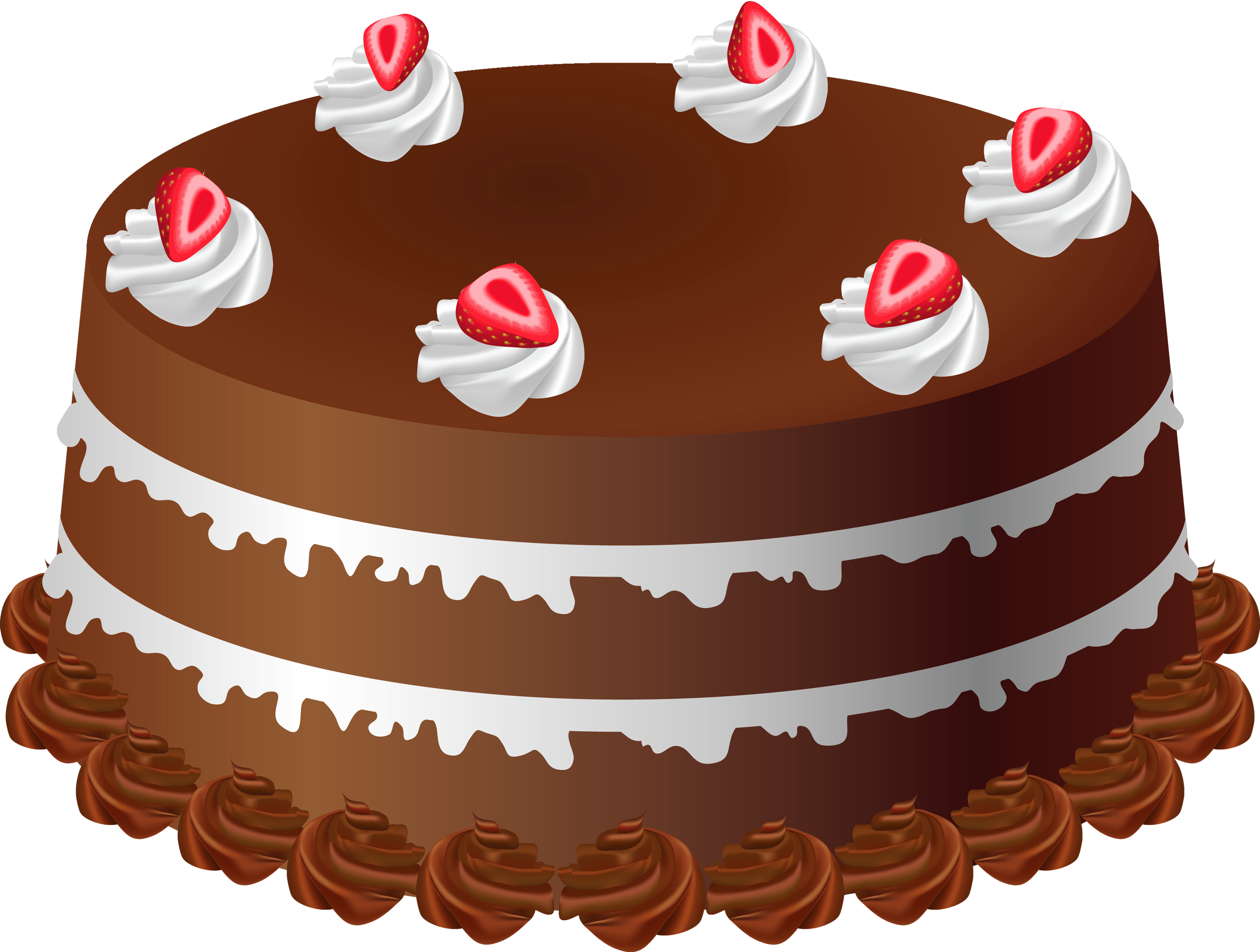
here is a beautiful animation of Plate and Glass lid by Learn code free online.
css effects for plate and glass lid on the cake. we have used cake transperent image here and rest is done with pure css only. one div element for plate and one for glass lid. that's it. see the below html code:
    <!DOCTYPE html>
    <html lang="en">
    <head>
        <link rel="stylesheet" href="style.css">
        <link rel="stylesheet" href="https://cdn.jsdelivr.net/npm/bootstrap@4.0.0/dist/css/bootstrap.min.css" integrity="sha384-Gn5384xqQ1aoWXA+058RXPxPg6fy4IWvTNh0E263XmFcJlSAwiGgFAW/dAiS6JXm" crossorigin="anonymous">

    </head>
    <body class="body_name">
        <div class="container-fluid">
            <div class="lid"></div>
            <img src="images/cake1.png" alt="">
            <div class="plate"></div>
        </div>

    </body>
    </html>
we are doing on hover animation here. all elements should be relative in position, only their pseudo elements will set to absolute position. see the below css code:
    body{
        width: 100vw;
        height: 100vh;
    }
    .container-fluid{
        position: relative;
        width: 100%;
        height: 100%;
        top: 0;
        left: 0;
        background-color: rgb(255, 255, 255);
    }

    .plate{
        position:relative;
        z-index: 1;
        top:0px;
        right: 0px;
        width: 400px;
        height: 150px;
        margin: 0 auto;
        border-bottom: 32px solid rgb(173, 55, 69);
        border-radius: 100%;
        transform: rotateX(50deg);
        background-color: rgb(209,181,181);
        box-shadow:3px 35px 5px 0px rgba(49,16,16,0.75) inset ;
    }
    img{
        width: 250px;
        height: 150px;
        position: relative;
        top: 100px;
        left: 50%;
        transform: translateX(-50%);
        z-index: 2;
    }
    .lid{
        width: 380px;
        height: 300px;
        border: 2px solid transparent;
        border-top-left-radius: 200px;
        border-top-right-radius: 200px;
        position: relative;
        top: 365px;
        left: 50%;
        transform: translateX(-50%);
        z-index: 3;
        background: radial-gradient(130% 230px at 50% -30px, rgba(34,32,32,0.4)95%, transparent 95%) no-repeat;
        transition: all ease-in-out 2s;
    }
    .lid::before{
        border-radius: 50%;
        width: 50px;
        height: 50px;
        position: absolute;
        top: -40px;
        left: 45%;
        content: '';
        z-index: 3;
        background: radial-gradient(circle at 100px 100px, rgb(231,196,196), rgb(39,16,16));
    }
    .lid::after{
        width: 350px;
        height: 170px;
        border-top-left-radius: 300px;
        border-top-right-radius: 300px;
        background: white;
        background: linear-gradient(90deg, rgba(255,255,255,0.3113620448179272) 23%, rgba(0,0,0,0.2945553221288515) 64%);
        position: absolute;
        top: 0px;
        left: 10px;
        content: '';
        z-index: 0;
        filter: blur(10px);
    }

    .lid:hover{
        transform: translateY(-240px) translateX(30px) rotateZ(50deg);
        transition: all ease-in-out 2s;
    }
Copyright2022 Learn code free online. All Rights Reserved.