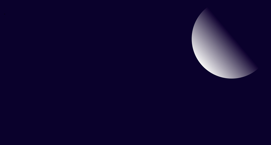
Moon and Clouds animation by Learn code free online.
On this page you will get to night sky animation.. moon and the peacefully floating clouds in the night sky.. We have used linear-gradient to give half moon like effect to div element. Here we used span elements to make clouds by styling them as circle, you can styling them as ellipse too by increasing width of an element than it's height and 50% border radius. You can create defferent shapes as much as you like by using clip-path property, as clouds does not have any specific shape. see the bellow html code:
    <!DOCTYPE html>
    <html lang="en">
    <head>
    <link rel="stylesheet" type="text/css" href="style.css">
    </head>
    <body class="pr0gti">

    <div class="sky">
    <div class="moon"></div>
    <div class="cloud1">
        <span class="clo1"></span>
        <span class="clo2"></span>
        <span class="clo3"></span>
        <span class="clo4"></span>
        <span class="clo5"></span>
    </div>
    <div class="cloud2">
        <span class="clo1"></span>
        <span class="clo2"></span>
        <span class="clo3"></span>
        <span class="clo4"></span>
        <span class="clo5"></span>
    </div>
    </div>

    </body>
    </html>
drawing svg images for clouds is easy but styling a div element as clouds is much easier. see the below css code:
    *{
        margin: 0;
        padding: 0;
        box-sizing: border-box;
        transition: all ease 0.5s;
    }
    html{
        overflow: hidden;
    }
    .pr0gti{
    min-height: 100vh;
    align-items: center;
    justify-content: center;
    background-color: rgb(18, 6, 48);
    overflow: hidden;
    }
    .pr0gti .sky{
      width: 100%;
      height: 100vh;
      position: relative;
    }
    .pr0gti .sky .moon{
      position:absolute;
      top: 0%;
      left: 50%;
      transform: translate(-50%, -50%);
      width: 400px;
      height: 400px;
      border-radius: 50%;
      align-items: center;
      justify-content: center;
      background: rgb(246,246,246);
      background: linear-gradient(0deg, rgba(246,246,246,1) 0%, rgba(255,255,255,0) 53%);
      transform: rotate(50deg);

    }
    .cloud1{
     position: absolute;
     top: 30%;
     left:5%;
     z-index: 2;
     z-index: 5;
     opacity: .8;
     animation: cloudjump 8s ease-in-out infinite;
    }
    .cloud2{
      position: absolute;
      top: 80%;
      right:50%;
      z-index: 2;
      z-index: 5;
      opacity: .8;
      animation: cloudjump 8s ease-in-out infinite .5s;

    }
    .cloud1 .clo1{
     position: absolute;
     left: 0px;
     width: 200px;
     height:200px;
      border-radius: 50%;
      opacity: 1;
      background-color: rgb(124, 124, 133);
      box-shadow: rgba(0, 0, 0, 0.45) 0px -60px 36px -28px inset;
    }
    .cloud1 .clo2{
      position: absolute;
      left:450px;
      top: 0px;
      width: 150px;
      height:150px;
       border-radius: 50%;
       opacity: 1;
       background-color: rgb(124, 124, 133);
       box-shadow: rgba(0, 0, 0, 0.45) 0px -60px 36px -28px inset;
     }
     .cloud1 .clo3{
      position: absolute;
      left: 100px;
      top: -100px;
      width: 300px;
      height:300px;
       border-radius: 50%;
       opacity: 1;
       background-color: rgb(124, 124, 133);
       box-shadow: rgba(18, 8, 8, 0.45) 0px -60px 36px -28px inset;
     }
     .cloud1 .clo4{
      position: absolute;
      top: 50px;
      left: 200px;
      width: 200px;
      height:200px;
       border-radius: 50%;
       opacity: 1;
       background-color: rgb(124, 124, 133);
       box-shadow: rgba(0, 0, 0, 0.45) 0px -60px 36px -28px inset;
     }
     .cloud1 .clo5{
      position: absolute;
      left: 300px;
      width: 200px;
      height:200px;
       border-radius: 50%;
       opacity: 1;
       background-color: rgb(124, 124, 133);
       box-shadow: rgba(0, 0, 0, 0.45) 0px -60px 36px -28px inset;

     }

     .cloud2 .clo1{
      position: absolute;
      left: 0px;
      width: 200px;
      height:200px;
       border-radius: 50%;
       opacity: 1;
       background-color: rgb(124, 124, 133);
       box-shadow: rgba(0, 0, 0, 0.45) 0px -60px 36px -28px inset;
     }
     .cloud2 .clo2{
       position: absolute;
       left:450px;
       top: 0px;
       width: 150px;
       height:150px;
        border-radius: 50%;
        opacity: 1;
        background-color: rgb(124, 124, 133);
        box-shadow: rgba(0, 0, 0, 0.45) 0px -60px 36px -28px inset;

      }
      .cloud2 .clo3{
       position: absolute;
       left: 100px;
       top: -100px;
       width: 300px;
       height:300px;
        border-radius: 50%;
        opacity: 1;
        background-color: rgb(124, 124, 133);
        box-shadow: rgba(18, 8, 8, 0.45) 0px -60px 36px -28px inset;
      }
      .cloud2 .clo4{
       position: absolute;
       top: 50px;
       left: 200px;
       width: 200px;
       height:200px;
        border-radius: 50%;
        opacity: 1;
        background-color: rgb(124, 124, 133);
        box-shadow: rgba(0, 0, 0, 0.45) 0px -60px 36px -28px inset;
      }
      .cloud2 .clo5{
       position: absolute;
       left: 300px;
       width: 200px;
       height:200px;
        border-radius: 50%;
        opacity: 1;
        background-color: rgb(124, 124, 133);
        box-shadow: rgba(0, 0, 0, 0.45) 0px -60px 36px -28px inset;

      }
     @keyframes cloudjump{
       0%{

       }
       50%{
         transform: translateY(-100px);
       }
     }
Copyright2022 Learn code free online. All Rights Reserved.