Coming Soon page for websites by using HTML and CSS and JS.
here is a beautiful coming soon page by Learn code free online.
Building Awesome Website
Coming Soon
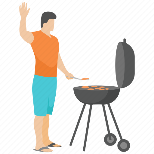
here we are using background image downloaded from Image by upklyak on Freepik. coming soon is a temporary landing page that's announcing new service in unique way, to tell visitors how much time is left to launch new exciting service. here you can see html code for the coming soon page below:
    <body>
        <header class="container-fluid sky_bg m-0 p-0">
    <div class="barbeque"><img src="images/barbeque.png" alt="barbeque" class=" img-fluid"></div>

    <!-- main info -->
    <div class="container hero text-center text-light">
    <p>Building Awesome Website</p>
    <h1 class="text-uppercase">Coming Soon</h1>
    <hr>
    <p id="launch"></p>
    </div>

    <!-- vapour -->
    <div class="wrap_steam">
      <div id="steam" class="steam1"></div>
      <div id="steam" class="steam2"></div>
      <div id="steam" class="steam3"></div>
      <div id="steam" class="steam4"></div>
      <div id="steam" class="steam5"></div>
    </div>


        </header>
        </body>
now we'll use javascript to show remaining time to viewers. see the below javascript code:
<!-- to open/close door and on/off sounds-->
<script type="text/javascript">
    var countDownDate = new Date("Jan 1, 2023 00:00:00").getTime();

    var x = setInterval(function(){

      var now = new Date().getTime();
      var distance = countDownDate - now;

      var days = Math.floor(distance / (1000*60*60*24));
      var hours = Math.floor(distance % (1000*60*60*24) / (1000*60*60));
      var minutes = Math.floor((distance % (1000*60*60)) / (1000*60));
      var seconds = Math.floor((distance % (1000*60)) / 1000);

    document.getElementById('launch').innerHTML = days + "d " + hours + "h " +minutes + "m " + seconds + "s ";
    if(distance < 0){
      clearInterval(x);
      Document.getElementById("launch").innerHTML= "EXPIRED";
    }
    },1000);

    </script>
here we are done with html and JS code now let's see css style. see the below CSS code.
    *{
        margin: 0;
        padding: 0;
        box-sizing: border-box;
        transition: ease all 0.5s;
    }

    body{
        font-family: 'Open Sans', sans-serif;
        width: 100vw;
    }
    .sky_bg{
        background: linear-gradient(rgba(0,0,0,.8),rgba(0,0,0,.8)), url("images/kitchen2.jpg");
        background-position: center;
        background-repeat: no-repeat;
        background-size: cover;
        height: 100vh;
        max-width: 100%;
    }

    .sky_bg .barbeque img{
        width:450px;
        height:auto;
        position: fixed;
        top: 290px;
        left: 30px;
        z-index: 99999;
    }


    /* vapour */
    .wrap_steam #steam {
        position: absolute;
        width: 50px;
        height: 50px;
        background-color: rgb(223, 212, 212);
        border-radius: 50%;
        opacity: 0;
        top: 500px;
        left:280px;
        z-index:99999;

      }
      .steam1 {
        animation: steam1 4.5s ease-out 1s infinite;
      }
      .steam3 {
        animation: steam1 3.5s ease-out 3s infinite;
      }

      .steam2 {
        animation: steam2 1s ease-out 1.5s infinite;
      }
      .steam4 {
        animation: steam2 2s ease-out 3.5s infinite;
      }
      .steam5 {
        animation: steam2 2.5s ease-out 4s infinite;
      }


      @keyframes steam1{
        0%{
          transform: translateY(0) translateX(0) scale(0.4);
          opacity: 0.25;
        }
        100%{
          transform: translateY(-20px) translateX(10px) scale(1);
          opacity: 0;
        }
      }
      @keyframes steam2{
        0%{
          transform: translateY(0) translateX(0) scale(0.5);
          opacity: 0.25;
        }
        100%{
          transform: translateY(-30px) translateX(-10px) scale(1);
          opacity: 0;
        }
      }
      @keyframes steam2{
        0%{
          transform: translateY(0) translateX(0) scale(0.5);
          opacity: 0.25;
        }
        100%{
          transform: translateY(-30px) translateX(-10px) scale(1);
          opacity: 0;
        }
      }


     /* main info */
     .hero{
         top: 50%;
         left: 50%;
         position: absolute;
         transform: translate(-50%,-50%);
         font-family: 'Dosis', sans-serif;
     }
     .hero h1{
         font-size: 60px;
         color: rgb(255, 255, 255);
     text-shadow: 0 0 10px white;
     }
     .hero hr{
         width: 30%;
         margin: 30px auto;
         border: 1.5px solid #fff;
     }
     .hero p{
         font-size: 20px;
         margin-bottom: 50px;
     }
     #launch{
         font-size: 40px;
         word-spacing: 20px;
     }
     @media only screen and (max-width:998px){
         .hero{
             position: absolute;
             top:190px;
         }
         .hero p{
             margin-bottom: 10px;
         }
     }
If you like our efforts, keep coming again on our page. Thanks.