Clay lamp animation by using html and css and svg.
Clay lamp animation by Learn code free online.
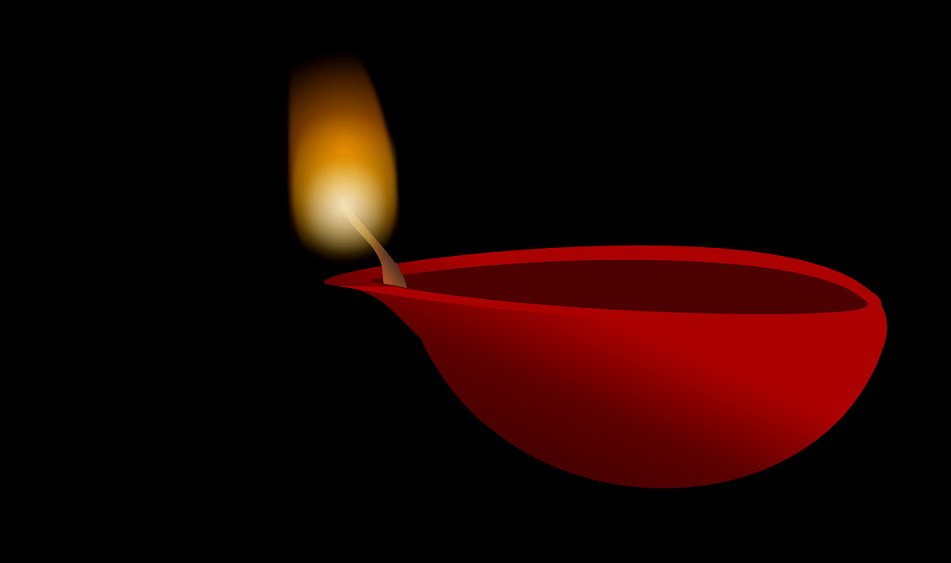
beautiful clay oil lamp animation. in this project we will see smoothing fire on clay lamp animation with pure css. we are going to use svg image for clay oil lamp here. so let's start with the html code for lamp. see the below code:
        <svg  viewbox="-200 -50 1200 600">
            <defs>
                <linearGradient id="Gradient1" x1="1" x2="0" y1="0" y2="1">
                  <stop class="stop1" offset="40%" style="stop-color: rgb(171, 6, 6)"/>
                  <stop class="stop2" offset="60%" style="  stop-color: #5d0303;"/>
                  <stop class="stop3" offset="100%" style="stop-color: #280202;"/>
                </linearGradient>
                <linearGradient id="Gradient2" x1="1" x2="0" y1="0" y2="1">
                    <stop class="stop4" offset="40%" style="stop-color: rgb(50, 43, 39)"/>
                    <stop class="stop5" offset="60%" style="  stop-color: sienna;"/>
                    <stop class="stop6" offset="100%" style="stop-color: sienna;"/>
                  </linearGradient>
            </defs>

            <path d="M 222.3 276.1 C 269.992 277.097 292.7 317.4 312.6 332.9 C 418.183 563.33 772.421 549.119 832.307 331.907 C 864.8 149.2 79.17 264.917 222.3 275.1" stroke="brown" stroke-width="0" fill="url(#Gradient1)"/>
              <path d="M 223.301 275.067 C 457.768 320.742 907.418 336.982 814.037 280.142" stroke-width="0" fill="rgb(171, 6, 6)"/>
              <path d="M 259.842 268.977 C 480.099 235.481 752.121 239.542 805.917 291.307 C 856.667 313.637 447.618 309.577 258.827 268.977" stroke=" #4d0000" stroke-width="3" fill=" #4d0000"/>
             <path d="M 331.907 366.418 L 330.892 365.403" stroke="teal" stroke-width="0.3" fill="sienna"/>
             <path d="M 790.692 279.127 C 718.626 245.632 498.369 230.406 256.797 267.962 C 422.243 305.517 612.05 289.277 789.677 280.142" stroke="sienna" stroke-width="0" fill=" #4d0000"/>
             <path d="M 331.907 366.418" stroke="sienna" stroke-width="0.5" fill="sienna"/>
             <path d="M 271.736 272.504 C 273.538 219.178 223.3013 218.5647 221.128 167.539 C 242.708 209.158 294.087 246.299 297.811 277.448 L 271.378 271.441 L 269.992 253.752 L 286.232 248.677 L 297.21 276.247" stroke="sienna" stroke-width="0" fill="url(#Gradient2)"/>
        </svg>
and here is html code for fire on lamp. we need only one div element for it. see the below html code:
<div class="fire"></div>
here is css code for fire animation. In the below css code body_name is the class name for body tag.
        .body_one{
            width:1300px;
            height: 800px;
            background: black;
        }
and now this is css code for fire div element, we have used ::before and ::after pseudo elements fto create different colors of flame:
        svg{
            z-index: 0;
        }

        .fire{
           position:absolute;
           top: 20px;
           left: 410px;
           z-index: 1;
           width: 140px;
           height: 350px;
           border-radius: 50%;
            border-top-left-radius: 25%;
            border-top-right-radius: 1925%;
           background: radial-gradient(circle, rgba(255, 132, 0, 0.83) 0%, rgba(213,172,36,0) 69%);
            filter: blur(3px);
            transform:rotate(-45%);
            animation: light 1.5s linear infinite;

        }

        .fire::before{
            content: '';
            position:absolute;
            top: 100px;
            left: 5px;
            width:130px;
            height: 250px;
            border-radius: 50%;
            border-top-right-radius: 0;
            background: radial-gradient(circle, rgba(252, 182, 0, 0.83) 0%, rgba(213, 98, 36, 0) 69%);
            z-index: 0;
        }
        .fire::after{
            content: '';
            position:absolute;
            top: 170px;
            left: 20px;
            width:100px;
            height:150px;
            border-radius: 50%;
            background: radial-gradient(circle, rgba(249, 249, 249, 0.83) 0%, rgba(255, 255, 255, 0) 69%);
           filter: blur(6px);
            z-index: 2;
        }

        @keyframes light{
            20%{
                border-top-left-radius: 1925%;
                border-top-right-radius: 25%;
                transform:translateY(0px);
            }
            60%{
                transform:translateY(-20px);
            }
            100%{
                    border-top-left-radius: 25%;
                    border-top-right-radius: 1925%;
                    transform:translateY(0px);
            }
        }