Falling letter and it's shadow animation by using html and css and svg.
Falling letter and it's shadow animation by Learn code free online.
Falling letter and it's shadow animation by Learn code free online.
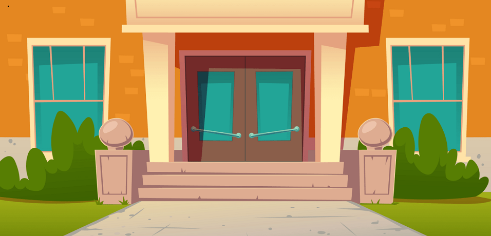
letter coming from Hogwarts school. hey, we have received an invitation letter from hogwarts school.. ha ha!! jokes apart..we are going to make a falling letter animation with css here. we will see how to make a shadow of any falling object too and will give some magic touch to this hogwarts letter, this is not a common letter though. we are making this completely with css only. we have used a house image in the background downloaded from freepik.com. so let's.. Wingardiummm Leviosaaa..! ha..ha.. CSS is much easier to pronounce.
    <body class="pr0gti">
        <div class="letter">
        <p>From Hogwarts School..</p>
        </div>
        <div class="shadow"></div>
        <div class="magicdust">
            <div class="madust1"></div>
            <div class="madust2"></div>
            <div class="madust3"></div>
            <div class="madust4"></div>
            <div class="madust5"></div>
            <div class="madust6"></div>
            <div class="madust7"></div>
            <div class="madust8"></div>
            <div class="madust9"></div>
            <div class="madust10"></div>
        </div>
        </body>
here we are not using box shadow for create shadow of falling letter. we are using a div element and style it as shadow. so let's see the below css code:
.pr0gti{
min-height: 100vh;
align-items: center;
justify-content: center;
background:url("images/img1.jpg");
background-size: contain;
overflow: hidden;
}
.pr0gti .letter{
width: 200px;
height: 200px;
position: absolute;
top: 400px;
left: 500px;
background-color: rgb(142, 88, 88);
z-index: 1;
box-shadow: rgba(0, 0, 0, 0.4) 0px 2px 4px, rgba(0, 0, 0, 0.3) 0px 7px 13px -3px, rgba(0, 0, 0, 0.2) 0px -3px 0px inset;
}
.pr0gti .letter p{
text-align: center;
position: relative;
top: 20px;
font-size: 2rem;
color: aliceblue;
animation: blinkanim 10s linear 12s;
animation-fill-mode: forwards;
}
.pr0gti .shadow{
width: 200px;
height: 200px;
position: absolute;
top: 400px;
left: 500px;
background-color: black;
border: 2px solid black;
z-index: 0;
}
.letter{
animation: fourteenanim 10s ease-in-out 2s;
animation-fill-mode: both;
}
.shadow{
animation: fourteenanimtwo 10s ease-in-out 2s;
animation-fill-mode: both;
}
@keyframes fourteenanim{
0%{
transform: translateY(-540px) rotateX(80deg) rotateX(80deg) translateX(-110vmin) rotate3d(1, 1, 1, -40deg);
}
20%{
transform: translateY(-330px) rotateX(80deg) translateX(20vmin) rotate3d(.5, .5, 1, -25deg) ;
}
40%{
transform: translateY(-220px) rotateX(80deg) translateX(-20vmin) rotate3d(.5, .5, 1, 25deg) ;
}
60%{
transform: translateY(-110px) rotateX(80deg) translateX(20vmin) rotate3d(.5, .5, 1, -10deg) ;
}
80%{
transform: translateY(-50px) rotateX(90deg) translateX(-20vmin) rotate3d(.5, .5, 1, 10deg) ;
}
100%{
transform: translateY(0px) rotateX(80deg) rotateZ(30deg);
transform-origin: bottom;
}
}
@keyframes fourteenanimtwo{
0%{
transform: translateY(0px) rotateX(80deg) rotateX(80deg) translateX(-100vmin) rotate3d(1, 1, 1, -40deg) scale(.5);
transform-origin:bottom;
opacity: 0.2;
filter: blur(50px);
}
20%{
transform: translateY(0px) rotateX(80deg) translateX(20vmin) rotate3d(.5, .5, 1, -25deg) scale(.6);
transform-origin: bottom;
opacity: 0.3;
filter: blur(50px);
}
40%{
transform: translateY(0px) rotateX(80deg) translateX(-20vmin) rotate3d(.5, .5, 1, 25deg) scale(.7);
transform-origin: bottom;
opacity: .4;
filter: blur(50px);
}
60%{
transform: translateY(0px) rotateX(80deg) translateX(20vmin) rotate3d(.5, .5, 1, -10deg) scale(.7);
transform-origin:bottom;
opacity: .5;
filter: blur(50px);
}
80%{
transform: translateY(0px) rotateX(90deg) translateX(-20vmin) rotate3d(.5, .5, 1, 5deg) scale(.8);
transform-origin:bottom;
opacity: 0.6;
filter: blur(40px);
}
100%{
transform: translateY(0px) rotateX(80deg) rotateZ(30deg) scale(1);
transform-origin: bottom;
opacity: .8;
filter: blur(0px);
}
}
.magicdust{
position: relative;
top: 580px;
left: 650px;
z-index: 3;
}
.magicdust .madust1{
position: absolute;
width:5px;
height:5px;
border: 2px solid white;
box-shadow: 0 0 1px white,
0 0 2px white,
0 0 3px white,
0 0 4px white,
0 0 5px white;
border-radius: 50%;
background-color: white;
animation: magical 5s linear infinite 15s;
animation-fill-mode: both;
visibility: hidden;
}
.magicdust .madust2{
position: absolute;
width:5px;
height:5px;
border: 2px solid white;
box-shadow: 0 0 1px white,
0 0 2px white,
0 0 3px white,
0 0 4px white,
0 0 5px white;
border-radius: 50%;
background-color: white;
animation: magical2 5s linear infinite 14s;
animation-fill-mode: both;
visibility: hidden;
}
.magicdust .madust3{
position: absolute;
width:5px;
height:5px;
border: 2px solid white;
box-shadow: 0 0 1px white,
0 0 2px white,
0 0 3px white,
0 0 4px white,
0 0 5px white;
border-radius: 50%;
background-color: white;
animation: magical3 7s linear infinite 17s;
animation-fill-mode: both;
visibility: hidden;
}
.magicdust .madust4{
position: absolute;
width:5px;
height:5px;
border: 2px solid white;
box-shadow: 0 0 1px white,
0 0 2px white,
0 0 3px white,
0 0 4px white,
0 0 5px white;
border-radius: 50%;
background-color: white;
animation: magical4 6s linear infinite 13s;
animation-fill-mode: both;
visibility: hidden;
}
.magicdust .madust5{
position: absolute;
width:5px;
height:5px;
border: 2px solid white;
box-shadow: 0 0 1px white,
0 0 2px white,
0 0 3px white,
0 0 4px white,
0 0 5px white;
border-radius: 50%;
background-color: white;
animation: magical5 7s linear infinite 16s;
animation-fill-mode: both;
visibility: hidden;
}
.magicdust .madust6{
position: absolute;
width:5px;
height:5px;
border: 2px solid white;
box-shadow: 0 0 1px white,
0 0 2px white,
0 0 3px white,
0 0 4px white,
0 0 5px white;
border-radius: 50%;
background-color: white;
animation: magical1 7s linear infinite 22s;
animation-fill-mode: both;
visibility: hidden;
}
.magicdust .madust7{
position: absolute;
width:5px;
height:5px;
border: 2px solid white;
box-shadow: 0 0 1px white,
0 0 2px white,
0 0 3px white,
0 0 4px white,
0 0 5px white;
border-radius: 50%;
background-color: white;
animation: magical2 7s linear infinite 21s;
animation-fill-mode: both;
visibility: hidden;
}
.magicdust .madust8{
position: absolute;
width:5px;
height:5px;
border: 2px solid white;
box-shadow: 0 0 1px white,
0 0 2px white,
0 0 3px white,
0 0 4px white,
0 0 5px white;
border-radius: 50%;
background-color: white;
animation: magical3 7s linear infinite 20s;
animation-fill-mode: both;
visibility: hidden;
}
.magicdust .madust9{
position: absolute;
width:5px;
height:5px;
border: 2px solid white;
box-shadow: 0 0 1px white,
0 0 2px white,
0 0 3px white,
0 0 4px white,
0 0 5px white;
border-radius: 50%;
background-color: white;
animation: magical4 7s linear infinite 19s;
animation-fill-mode: both;
visibility: hidden;
}
.magicdust .madust10{
position: absolute;
width:5px;
height:5px;
border: 2px solid white;
box-shadow: 0 0 1px white,
0 0 2px white,
0 0 3px white,
0 0 4px white,
0 0 5px white;
border-radius: 50%;
background-color: white;
animation: magical5 7s linear infinite 18s;
animation-fill-mode: both;
visibility: hidden;
}
@keyframes magical{
0%{
transform: scale(0);
visibility: visible;
}
10%{
transform: scale(0.1);
}
30%{
transform: translateY(-20px);
}
60%{
transform: translateY(-90px) translateX(-20px) ;
opacity: 1;
}
100%{
transform: translateY(-160px) translateX(10px) scale(1);
opacity: 0;
}
}
@keyframes magical2{
0%{
transform: scale(0);
visibility: visible;
}
10%{
transform: scale(0.1);
}
30%{
transform: translateY(-30px);
}
60%{
transform: translateY(-100px) translateX(20px) ;
opacity: 1;
}
100%{
transform: translateY(-160px) translateX(-10px) scale(1);
opacity: 0;
}
}
@keyframes magical3{
0%{
transform: scale(0);
visibility: visible;
}
10%{
transform: scale(0.1);
}
30%{
transform: translateY(-20px);
}
60%{
transform: translateY(-40px) translateX(-20px) ;
opacity: 1;
}
100%{
transform: translateY(-160px) translateX(10px) scale(1);
opacity: 0;
}
}
@keyframes magical4{
0%{
transform: scale(0);
visibility: visible;
}
10%{
transform: scale(0.1);
}
30%{
transform: translateY(-30px);
}
60%{
transform: translateY(-100px) translateX(20px) ;
opacity: 1;
}
100%{
transform: translateY(-160px) translateX(-10px) scale(1);
opacity: 0;
}
}
@keyframes magical5{
0%{
transform: scale(0);
visibility: visible;
}
10%{
transform: scale(0.1);
}
30%{
transform: translateY(-20px);
}
60%{
transform: translateY(-130px) translateX(-20px) ;
opacity: 1;
}
100%{
transform: translateY(-160px) translateX(10px) scale(1);
opacity: 0;
}
}
@keyframes blinkanim{
0%{
}
100%{
text-shadow: 0 0 10px white,
0 0 20px white,
0 0 30px white,
0 0 40px white,
0 0 50px white,
0 0 60px white,
0 0 70px white,
0 0 80px white,
0 0 90px white,
0 0 120px white;
}
}
Copyright2022 Learn code free online. All Rights Reserved.