cold rainy night and hot tea cup animation by using html and css and svg.

cold rainy night and hot tea cup animation by Learn code free online.


rain gif

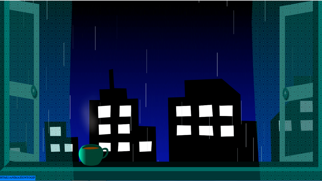
welcome to the HTML CSS tutorial by PRGTI free coder. here we are learning css by creating some amazing animations. As everyone knows, nothing is more relaxing than to sit in front of the window while sipping a nice hot tea and listening to the rhythmic rain showers outside. Here we are trying to create this scenerio with the help of HTML, CSS,SVG and JS. we are gonna use city silhouette and tea cup svg images and rest is designed completely with CSS. if you want to make tea cup with css then check here: Hot tea cup using CSS only.
Here is HTML code and little bit of Javascript code(at the end). Create a new page in any html code editor, (I'm using visual studio code, trust me it's best for beginners.) and you can copy-paste this code in your html page, but it's always better to write down by yourself to learn css. so let's start with the html code. first we'll design the city silhouette


    <body class="raininginwindow">
        <div class="container-fluid">
        <!-- code for city svg image   -->
        <div class="city">
        <svg id="bldg" viewbox="209 167 630 389">
            <path d="M 205.039 490.018 L 203.856 421.419 L 221.597 420.828 L 221.006 388.894 L 263.584 387.12 L 263.584 419.054 L 285.465 418.462 L 284.874 445.074 L 301.432 445.074 L 297.884 348.089 L 339.28 348.089 L 339.871 378.841 L 362.343 377.658 L 364.709 435.021 L 384.815 435.021 L 384.815 306.102 L 405.513 306.102 L 404.33 285.404 L 424.437 284.813 L 422.663 247.557 L 430.351 245.783 L 432.716 283.039 L 456.371 283.63 L 458.145 303.737 L 478.843 303.145 L 480.026 356.369 L 513.142 357.551 L 514.916 437.978 L 539.754 437.978 L 537.388 301.371 L 570.505 300.189 L 569.322 267.663 L 641.47 264.706 L 677.543 295.458 L 678.726 346.315 L 709.477 346.907 L 714.799 485.879 L 739.045 486.47 L 736.089 346.315 L 782.215 298.414 L 781.033 259.384 L 828.339 259.384 L 830.116 485.879 L 204.447 490.018" stroke="black" stroke-width=".3" fill="black"/> 
            <path d="M 231.65 418.462 L 230.468 398.947 L 249.983 398.356 L 251.166 418.462 L 231.65 419.054" stroke="black" stroke-width=".3" fill="white"/> 
             <path d="M 308.528 358.142 L 329.226 357.551 L 329.817 375.883 L 308.528 375.883 L 307.936 358.142" stroke="black" stroke-width=".3" fill="white"/>  
             <path d="M 309.119 391.259 L 326.86 391.259 L 328.043 406.043 L 310.302 406.634 L 309.119 391.85" stroke="black" stroke-width=".3" fill="white"/>  
             <path d="M 336.912 390.667 L 352.288 391.259 L 352.288 406.043 L 336.912 406.634 L 336.321 390.667" stroke="black" stroke-width=".3" fill="white"/>  
             <path d="M 402.554 317.929 L 426.209 316.155 L 425.617 339.218 L 401.963 340.992 L 401.371 318.52" stroke="black" stroke-width=".3" fill="white"/>  
             <path d="M 443.358 316.746 L 465.831 316.155 L 465.239 338.035 L 442.767 338.627 L 443.358 317.338" stroke="black" stroke-width=".3" fill="white"/>  
             <path d="M 402.554 353.411 L 425.617 352.82 L 426.209 371.744 L 403.145 373.518 L 402.554 353.411" stroke="black" stroke-width=".3" fill="white"/>  
             <path d="M 439.81 353.411 L 462.873 352.229 L 463.464 371.153 L 440.401 371.153 L 440.401 351.637" stroke="black" stroke-width=".3" fill="white"/>  
             <path d="M 403.736 388.302 L 426.208 388.894 L 426.208 405.452 L 402.553 406.043 L 403.145 388.302" stroke="black" stroke-width=".3" fill="white"/>  
             <path d="M 439.81 387.711 L 462.873 387.711 L 463.464 404.861 L 439.81 406.043 L 440.992 388.302" stroke="black" stroke-width=".3" fill="white"/>  
             <path d="M 481.205 386.528 L 506.043 385.937 L 504.86 405.452 L 481.796 406.635 L 481.205 387.119" stroke="black" stroke-width=".3" fill="white"/>  
             <path d="M 552.169 317.929 L 581.146 316.747 L 582.329 337.444 L 553.352 338.036 L 552.761 318.521" stroke="black" stroke-width=".3" fill="white"/>  
             <path d="M 596.522 316.747 L 622.542 314.972 L 624.316 338.036 L 597.705 339.219 L 597.113 317.338" stroke="black" stroke-width=".3" fill="white"/>  
             <path d="M 637.918 316.747 L 662.755 316.155 L 662.755 337.444 L 637.327 336.853 L 636.735 316.155" stroke="black" stroke-width=".3" fill="white"/>  
             <path d="M 553.943 354.594 L 581.738 355.186 L 582.329 373.518 L 553.943 374.701 L 554.535 354.594" stroke="black" stroke-width=".3" fill="white"/>  
             <path d="M 597.113 355.777 L 623.725 355.777 L 625.499 375.292 L 597.705 374.109 L 597.113 355.186" stroke="black" stroke-width=".3" fill="white"/>  
             <path d="M 638.509 355.777 L 664.53 355.186 L 665.121 376.475 L 639.692 377.066 L 639.101 355.777" stroke="black" stroke-width=".3" fill="white"/>  
             <path d="M 793.448 307.285 L 817.694 307.285 L 818.286 329.165 L 793.448 329.757 L 793.448 307.285" stroke="black" stroke-width=".3" fill="white"/>
             <path d="M 794.04 345.132 L 818.286 344.541 L 818.286 365.239 L 795.222 365.83 L 794.04 345.724 L 794.04 345.724" stroke="black" stroke-width=".3" fill="white"/>
             <path d="M 753.826 345.724 L 776.298 345.132 L 777.481 365.83 L 752.644 366.422 L 752.052 345.724" stroke="black" stroke-width=".3" fill="white"/>
        </svg>


always give a class to body tag it's a good practice, it prevents lots of problems in coding. here is the css code for building svg image and body tag:

            .raininginwindow{
                margin: 0;
                padding: 0;
                width: 100vw;
                height: 100vh;
                background-color: black;
                background: linear-gradient(180deg, rgba(0,0,1,1) 0%, rgba(0,15,177,0.9360119047619048) 100%);
                background-size: contain;
                perspective: 50em;
                display: flex;
                perspective-origin: 50% calc(50%-2em);
                z-index: -1;
                overflow-x: hidden;
            }
            svg{
                position: absolute;
                bottom: -200px;
            }
            .city{
                width: 100vw;
                z-index: 0;
            }
        

after city we will go for hot tea cup and it's steaming, we are using four divs elements to show steaming over tea, see the below html code:

>
            
            <svg id="tea" viewbox="131 195 806 497">
                <linearGradient id="Gradient1" x1="1" x2="0" y1="0" y2="0">
                  <stop class="stop1" offset="70%" style="stop-color:  #014433;"/>
                  <stop class="stop3" offset="100%" style="stop-color:   #00ffbf;"/>
                </linearGradient>  
                <path d="M 353.743 373.272 C 295.982 431.623 334.882 497.635 370.749 527.519 C 409.324 544.159 455.119 540.662 487.988 529.031 C 536.457 488.794 555.317 406.278 502.271 370.915 C 483.411 351.464 390.286 347.928 353.153 373.272" stroke="white" stroke-width="0"
                fill="url(#Gradient1)"/> >
                <path d="M 356.69 391.543 C 407.378 374.451 481.053 377.987 498.735 388.007 C 496.967 393.901 411.504 409.814 356.69 392.133" stroke="white" stroke-width="0"
                fill="#804000"/> 
                <path d="M 354.333 383.881 C 417.988 351.464 472.212 366.788 503.451 379.755 C 504.629 383.881 502.359 386.077 498.735 388.596 C 488.716 380.345 406.789 371.504 356.69 392.133 C 357.28 391.543 352.596 390.615 354.922 383.292" stroke="white" stroke-width="0"
                fill=" #003326"/> 
              <path d="M 523.537 393.64 C 602.957 358.09 586.317 472.303 523.537 479.111 L 529.588 467.009 C 550.011 460.201 588.586 386.833 529.588 405.742 L 523.537 392.884" stroke="#014433" stroke-width=".3"
              fill="#014433"/>  
              </svg>
              
              <div class="steam1"></div>
              <div class="steam2"></div>
              <div class="steam3"></div>
              <div class="steam4"></div>


now we'll see the css styling for hot tea cup and it's steam.. we are giving div element a steam like shape with border property. you can use clip path property too here. that will be more easy to show different sizes of steam, but here we will use border and will apply animation with transform using keyframes property. see the code below:

            .steam1{
                position:absolute;
                left:370px;
                top:570px;
                width:15px;
                height: 70px;
                transform:rotate(-15deg);
                background-color:transparent;
                border-radius: 10% 50% 130px 0px;
                border-right: 30px solid rgba(232, 225, 225, 0.4);
                filter:blur(15px);
                z-index: 6;
                animation: steaming1 6s linear infinite 1s;
                opacity: 0;
            }
            @keyframes steaming1{
                10%{
                    opacity: 1; 
                }
               
                100%{
                    transform: translateY(-200px) translateX(20px);
                    opacity: 0;
                   filter: blur(15px);
                }
            }
            @keyframes steaming2{
               
                10%{
                    opacity: 1; 
                }
                100%{
                    transform: translateY(-200px) translateX(-20px);
                    opacity: 0;
                    filter: blur(15px);
                }
            }
            .steam2{
                position:absolute;
                left:370px;
                top:570px;
                width:15px;
                height: 70px;
                transform:rotate(20deg);
                background-color:transparent;
                border-radius: 50% 10% 0px 130px;
                border-left: 30px solid rgba(232, 225, 225, 0.4);
                filter:blur(15px);
                z-index: 6;
                animation: steaming2 6s linear infinite 2s;
               opacity: 0;
            }
            .steam3{
                position:absolute;
                left:370px;
                top:570px;
                width:15px;
                height: 70px;
                transform:rotate(-15deg);
                background-color:transparent;
                border-radius: 10% 50% 130px 0px;
                border-right: 30px solid rgba(232, 225, 225, 0.4);
                filter:blur(15px);
                z-index: 6;
                animation: steaming2 6s linear infinite 3s;
                opacity: 0;
            }
            .steam4{
                position:absolute;
                left:370px;
                top:570px;
                width:15px;
                height: 70px;
                transform:rotate(20deg);
                background-color:transparent;
                border-radius: 50% 10% 0px 130px;
                border-left: 30px solid rgba(232, 225, 225, 0.4);
                filter:blur(15px);
                z-index: 6;
                animation: steaming1 6s linear infinite 4s;
               opacity: 0;
            }            
        

here is html code for rain. we are putting rain animation in a div named box.

            
                <div class="box">
                    <div class="rain"></div> 
                </div>      


here we will use javascript code to animate rain. create div element with creatElement property and ada class "rain" into it. we are using "math.random" property to create random rain drops.

                
                    <script>
                        setInterval(createSnowFlake, 10);

                        function createSnowFlake() {
                            const snowbox = document.querySelector(".box");

                            const snow_flake = document.createElement('div');
                            snow_flake.classList.add("rain");
                            snow_flake.style.left = Math.random() * innerWidth + 'px';
                            snow_flake.style.animationDuration = Math.random() * 1 + .2 + 's';
                            snow_flake.style.opacity = Math.random();
                            snow_flake.style.animationDelay = "2s";
                            snow_flake.style.fontSize = Math.random() * 10 + 10 + 'px';
                            snowbox.appendChild(snow_flake);

                            setTimeout(() => {
                                snow_flake.remove();
                            }, 6000);
                        }
                    </script>


css for raining animation, height of the element where rain animation going to be reside should be more than viewport height in size i.e. 120vh.


                /* raining */
.box{
	width:100vw;
    height: 120vh;  
    position: absolute;
    top: 0;
    left: 0;
    overflow: hidden;
animation-fill-mode: forwards;
display:table;
background-color:transparent;
z-index: 1;
}

.rain{
    animation: fall linear forwards;
    color: rgb(255, 255, 255);
    position:absolute; 
    top: -100px;
    z-index: 99999;
	width: 2px;
    height: 100px;
    background-color: rgba(203, 211, 218,.7);
}
	
@keyframes fall{
    to{
   transform: translateY(130vh);
    }
}
            

now the next one is window frame, window doors and wall below the window. see the below html code:


                <!-- code for window doors -->
        <div class="door1"></div>
        <div class="door2"></div>
        
        <!-- code for window frame -->
        <div class="window"></div>
        
        <!-- code for wall below window -->
        <div class="wall"></div>


css for window frame, wall and window doors. use groove border to div look like window frame. see the setting of z-indexs in below so that divs can overlay properly on each other. we are using ::after and ::before pseudo elements to create window door frames. transform-origin is essential property here for doors to look like open to outside.


                .window{
                    width: 100vw;
                    height: 730px;
                    border-left: 45px groove rgb(2, 106, 99);
                    border-right: 45px groove rgb(2, 106, 99);
                    border-bottom: 45px groove rgb(2, 106, 99);
                    position: absolute;
                    top: 0;
                    left: 0px;
                    z-index: 2;
                }
                .wall{
                    width: 100vw;
                    height: 200px;
                    position: absolute;
                    top: 725px;
                    left: 0px;
                    background-color:rgb(1, 57, 57);
                    z-index:4;
                }
                .door1{
                    position: absolute;
                    top: 0px;
                    right: 0px;
                    width:370px;
                    height:680px;
                    border: 45px solid rgb(73, 116, 112);
                    z-index: 2;
                    background-size: 1em 1em;
                    background-color: rgba(29, 57, 54, .6);
                    transform:skewY(-10deg) rotateY(-60deg);
                    transform-origin: 100% 50% 0px;
                
                }
                .door1::before{
                    content: '';
                    width:350px;
                    height:60px;
                    background-color: rgb(73, 116, 112);
                   position: absolute;
                   top: 300px;
                }
                .door1::after{
                    content: '';
                    width:45px;
                    height:45px;
                    border-radius: 50%;
                    box-shadow: 10px 10px 5px 0px rgba(0,0,0,0.75);
                    background: radial-gradient(circle, rgba(106,156,141,0.9808298319327731) 0%, rgba(24,55,48,0.8575805322128851) 32%);
                   position: absolute;
                   top: 300px;
                   left: -20px;  
                }
                .door2{
                    position: absolute;
                    top: 23px;
                    left: -200px;
                    width:370px;
                    height:680px;
                    border: 45px solid rgb(73, 116, 112);
                    z-index: 2;
                    background-size: 1em 1em;
                    background-color: rgba(29, 57, 54, .6);
                    transform:skewY(10deg) rotateY(60deg);
                    transform-origin: 100% 50% 0px;
                
                }
                .door2::before{
                    content: '';
                    width:320px;
                    height:60px;
                    background-color: rgb(73, 116, 112);
                   position: absolute;
                   top: 300px;
                }
                .door2::after{
                    content: '';
                    width:45px;
                    height:45px;
                    border-radius: 50%;
                    box-shadow: 10px 10px 5px 0px rgba(0,0,0,0.75);
                    background: radial-gradient(circle, rgba(106,156,141,0.9808298319327731) 0%, rgba(24,55,48,0.8575805322128851) 32%);
                   position: absolute;
                   top: 300px;
                   right: -20px;  
                }
            

now the last piece of html code is for curtains..see the below code:


          <div class="curton1">
        </div>  
        <div class="curton2">
      </div> 


and here is css code for the animation of curtains. We are using "repeating-radial-gradient" to create design on curtains here. you can use any background image or background-color to look better. here we have focused on not using any images that already placed somewhere on the internet by someone else and see our curtains are looking absolutely fabulous..isn't it?


                .curton1{
                    position: absolute;
                    top: -200px;
                    right:-10px;
                   display: inline-flex;
                    height:990px;
                    width: 550px;
                    background: repeating-radial-gradient(circle, rgba(0, 255, 242, 0.614) 50%, rgba(1, 28, 28, .8) 70%);
                   opacity: .5;
                  transform-style: preserve-3d;
                 background-size: 2em 2em;
                 clip-path: polygon(100% 0, 47% 0, 47% 13%, 48% 30%, 51% 46%, 55% 67%, 55% 89%, 50% 100%, 100% 100%);
                 animation: ray1 4s ease-in-out infinite;
                z-index: 5;
                }
                .curton2{
                    position: absolute;
                    top: -200px;
                    left:0px;
                   display: inline-flex;
                    height:990px;
                    width: 550px;
                    background: repeating-radial-gradient(circle, rgba(0, 255, 242, 0.614) 50%, rgba(1, 28, 28, .8) 70%);
                   opacity: .5;
                  transform-style: preserve-3d;
                 background-size: 2em 2em;
                 clip-path: polygon(0 0, 65% 0, 60% 23%, 55% 42%, 48% 63%, 43% 81%, 42% 91%, 43% 100%, 0 100%);
                 animation: ray2 4s ease-in-out infinite;
                z-index: 5;
                }
                
                @keyframes ray1{
                    0%{
                        
                    }
                    50%{
                        clip-path: polygon(100% 0, 47% 0, 44% 17%, 43% 30%, 44% 48%, 46% 72%, 49% 92%, 50% 100%, 100% 100%);
                    }
                    100%{
                        clip-path: polygon(100% 0, 47% 0, 47% 13%, 48% 30%, 51% 46%, 55% 67%, 55% 89%, 50% 100%, 100% 100%);
                    }
                }
                @keyframes ray2{
                    0%{
                        
                    }
                    50%{
                        clip-path: polygon(0 0, 55% 0, 56% 23%, 55% 42%, 54% 67%, 57% 91%, 58% 99%, 59% 100%, 0 100%);
                    }
                    100%{
                        clip-path: polygon(0 0, 65% 0, 60% 23%, 55% 42%, 48% 63%, 43% 81%, 42% 91%, 43% 100%, 0 100%);
                    }
                }
            

Learn code free online
Terms and Conditions
Privacy Policy
Backend vector created by storyset - www.freepik.com
Watercolor wallpaper vector created by freepik - www.freepik.com