Blinking stars animation by using html and css and svg.
Blinking stars animation by Learn code free online.
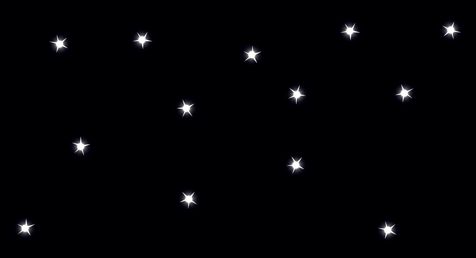
twinkle.. twinkle.. littile star.. how i wonder what you are!!? stars are always wondrous thing for me. so here is one more night sky animation for blinking stars.. see the below html code:
    <body>
        <header class="sky_bg">
            <div class="star1_wrap1 blink"></div>
            <span class="star1"></span>
            <div class="star1_wrap2 blink"></div>
            <span class="star2"></span>
            <div class="star1_wrap3 blink"></div>
            <span class="star3"></span>
            <div class="star1_wrap4 blink"></div>
            <span class="star4"></span>
            <div class="star1_wrap5 blink"></div>
            <span class="star5"></span>
            <div class="star1_wrap6 blink"></div>
            <span class="star6"></span>
            <div class="star1_wrap7 blink"></div>
            <span class="star7"></span>
            <div class="star1_wrap8 blink"></div>
            <span class="star8"></span>
            <div class="star1_wrap9 blink"></div>
            <span class="star9"></span>
            <div class="star1_wrap10 blink"></div>
            <span class="star10"></span>
            <div class="star1_wrap11 blink"></div>
            <span class="star11"></span>
            <div class="star1_wrap12 blink"></div>
            <span class="star12"></span>
            <div class="star1_wrap13 blink"></div>
            <span class="star13"></span>
        </header>

    </body>
see the below css code for blinking stars:
            *{
                margin: 0;
                padding: 0;
                box-sizing: border-box;
                transition: ease all 0.5s;
            }

            .sky_bg{
                background-color: rgb(2, 1, 11);
                width: 100vw;
                height: 110vh;
            }

            /* queries for stars */
             header span{
                 background-color:white;
                 position: absolute;
                 height: 100px;
                 width: 100px;
                 z-index: 1;
                 clip-path: polygon(50% 0%, 52% 37%, 98% 35%, 56% 44%, 79% 91%, 51% 48%, 21% 91%, 44% 45%, 2% 35%, 46% 38%);
             }

             header .star1{
                 transform: rotate(20deg);
                 position: absolute;
                 top: 50px;
                 right: 30px;
                 animation: pulsate .3s ease-in-out infinite;
                 z-index: 0;

             }
             header .star2{
                transform: rotate(-20deg);
                position: absolute;
                top: 228px;
                right: 157px;
                animation: pulsate .3s ease-in-out infinite;
                z-index: 0;
            }
            header .star3{
                transform: rotate(40deg);
                position: absolute;
                top: 530px;
                right: 777px;
                animation: pulsate .3s ease-in-out infinite;
                z-index: 0;
            }
            header .star4{
                transform: rotate(60deg);
                position: absolute;
                top: 270px;
                right: 786px;
                animation: pulsate .3s ease-in-out infinite;
                z-index: 0;
            }
            header .star5{
                transform: rotate(80deg);
                position: absolute;
                top: 375px;
                right: 1086px;
                animation: pulsate .3s ease-in-out infinite;
                z-index: 0;
            }
            header .star6{
                transform: rotate(100deg);
                position: absolute;
                top: 225px;
                right: 474px;
                animation: pulsate .3s ease-in-out infinite;
                z-index: 0;
            }
            header .star7{
                transform: rotate(120deg);
                position: absolute;
                top: 423px;
                right: 475px;
                animation: pulsate .3s ease-in-out infinite;
                z-index: 0;
            }
            header .star8{
                transform: rotate(150deg);
                position: absolute;
                top: 600px;
                right: 1240px;
                animation: pulsate .3s ease-in-out infinite;
                z-index: 0;
            }
            header .star9{
                transform: rotate(180deg);
                position: absolute;
                top: 38px;
                right: 315px;
                animation: pulsate .3s ease-in-out infinite;
                z-index: 0;
            }
            header .star10{
                transform: rotate(200deg);
                position: absolute;
                top: 605px;
                right: 206px;
                animation: pulsate .3s ease-in-out infinite;
                z-index: 0;
            }
            header .star11{
                transform: rotate(150deg);
                position: absolute;
                top: 108px;
                right: 597px;
                animation: pulsate .3s ease-in-out infinite;
                z-index: 0;
            }
            header .star12{
                transform: rotate(180deg);
                position: absolute;
                top: 63px;
                right:905px;
                animation: pulsate .3s ease-in-out infinite;
                z-index: 0;
            }
            header .star13{
                transform: rotate(200deg);
                position: absolute;
                top: 74px;
                right:1139px;
                animation: pulsate .3s ease-in-out infinite;
                z-index: 0;
            }
            /* queries for stars end */

            /* queries for star's blinking light */

            .sky_bg .blink{
                padding: 10px;
                background-color:white;
                animation: borderchange .3s linear infinite;
                box-shadow: 0 0 0 500px white;
                border-radius: 50%;
            }
            .sky_bg .star1_wrap1{
                position: absolute;
                top: 82px;
                right: 69px;
                z-index: 1;
            }
            .sky_bg .star1_wrap2{
                position: absolute;
                top: 262px;
                right: 201px;
                z-index: 1;
            }
            .sky_bg .star1_wrap3{
                position: absolute;
                top: 564px;
                right: 813px;
                z-index: 1;
            }
            .sky_bg .star1_wrap4{
                position: absolute;
                top: 305px;
                right: 820px;
                z-index: 1;
            }
            .sky_bg .star1_wrap5{
                position: absolute;
                top: 414px;
                right: 1120px;
                z-index: 1;
            }
            .sky_bg .star1_wrap6{
                position: absolute;
                top: 266px;
                right: 506px;
                z-index: 1;
            }
            .sky_bg .star1_wrap7{
                position: absolute;
                top: 467px;
                right: 509px;
                z-index: 1;
            }
            .sky_bg .star1_wrap8{
                position: absolute;
                top: 647px;
                right: 1278px;
                z-index: 1;
            }
            .sky_bg .star1_wrap9{
                position: absolute;
                top: 85px;
                right: 356px;
                z-index: 1;
            }
            .sky_bg .star1_wrap10{
                position: absolute;
                top: 652px;
                right: 248px;
                z-index: 1;
            }
            .sky_bg .star1_wrap11{
                position: absolute;
                top: 152px;
                right: 634px;
                z-index: 1;
            }
            .sky_bg .star1_wrap12{
                position: absolute;
                top: 110px;
                right: 946px;
                z-index: 1;
            }
            .sky_bg .star1_wrap13{
                position: absolute;
                top: 122px;
                right:1180px;
                z-index: 1;
            }
            /* queries for star's blinking light end */


            /* animation for blinking background */
            @keyframes borderchange{
                0%{
                  box-shadow: 0 0 15px  white,
                              0 0 50px  white,
                              0 0 75px  white,
                              0 0 15px  white,
                              0 0 50px  white,
                              0 0 75px  white,
                              0 0 15px  white,
                              0 0 50px  white,
                              0 0 75px  white;
                }
                50%{
                  box-shadow: none;
                }
                100%{
                    box-shadow: 0 0 15px  white,
                    0 0 50px  white,
                    0 0 75px  white,
                    0 0 15px white,
                    0 0 50px white,
                    0 0 75px white,
                    0 0 15px white,
                    0 0 50px white,
                    0 0 75px white;
                }
            }

            /* blinking star animation */
            @keyframes pulsate{
                0%{

                    clip-path: polygon(50% 0%, 52% 37%, 98% 35%, 56% 44%, 79% 91%, 51% 48%, 21% 91%, 44% 45%, 2% 35%, 46% 38%);
                }
                50%{

                    clip-path: polygon(48% 21%, 53% 41%, 72% 40%, 54% 45%, 61% 57%, 49% 45%, 39% 59%, 43% 45%, 27% 40%, 46% 40%);
                }
                100%{

                    clip-path: polygon(50% 0%, 52% 37%, 98% 35%, 56% 44%, 79% 91%, 51% 48%, 21% 91%, 44% 45%, 2% 35%, 46% 38%);
                }
            }