Youtube subscribe button animation by using html and css and svg.

Youtube subscribe button animation by Learn code free online.


Youtube subscribe button gif

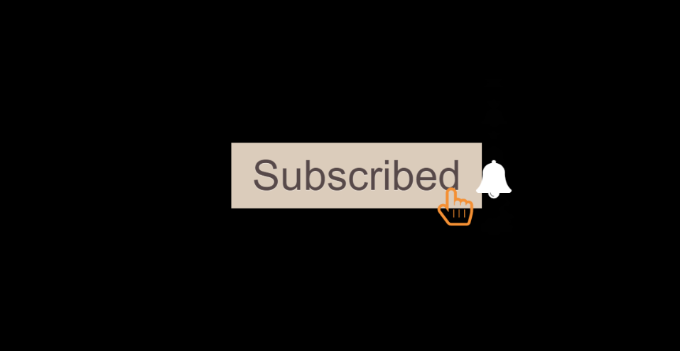
animated subscribe youtube button. there are so many animations available on youtube for subscribe button so I think we have to make something different animation for this button. so here it is.. helloo.. PRGTI free coder is available on youtube too.. don't forget to subscribe our channel to get our animation videos... see the below html code:


    <body>
        <div class="container-fluid">
      <button class="btn subscribe"></button>  
      <i class="fa fa-bell fa-4x" aria-hidden="true"></i>  
      <i class="fa fa-hand-pointer-o fa-4x" aria-hidden="true"></i>
        </div>
             
     </body>


see the below css code for Subscribe button:


            body{
                width: 100vw;
                height: 100vh;
                background-color: rgb(1, 1, 1);
                overflow: hidden;
            }
            .subscribe{
                padding: 15px 35px;
                font-size: 70px;
                background-color: red;
                color: rgb(255, 255, 255);
                box-shadow: rgba(0, 0, 0, 0.4) 0px 2px 4px, rgba(0, 0, 0, 0.3) 0px 7px 13px -3px, rgba(0, 0, 0, 0.2) 0px -3px 0px inset;
                position: absolute;
                top: 40%;
                left: 35%;
                transform: translate(-50%,-50%);
                animation:elevenanim 3s ease-in-out 3s,
                falling 1s ease-in-out 8.9s,
                standingcard 1s ease-in-out 11s, 
                clicked 1s ease 14s;
                transform: scale3d(0,0,0);
                opacity: 0;
                animation-fill-mode: forwards;
                text-shadow: 0 1px 0 #ccc,
                           0 2px 0 #c9c9c9,
                           0 3px 0 #bbb,
                           0 4px 0 #b9b9b9,
                           0 5px 0 #aaa,
                           0 6px 1px rgba(0,0,0,.1),
                           0 0 5px rgba(0,0,0,.1),
                           0 1px 3px rgba(0,0,0,.3),
                           0 3px 5px rgba(0,0,0,.2),
                           0 5px 10px rgba(0,0,0,.25),
                           0 10px 10px rgba(0,0,0,.2),
                           0 20px 20px rgba(0,0,0,.15);
            
            }
            .subscribe::before{
                content: 'Subscribe';
                animation: changetext .5s ease 14.3s;
               animation-fill-mode: both;
            }
            .fa-bell{
                position: absolute;
                font-size: 150px;
                color: white;
                z-index: 99999;
                position: absolute;
                top: 44%;
                left: 65%;
                z-index: 2;
                animation: elevenanimfa 3s ease-in-out 6s,
                standingbell 1s ease-in-out 11s,
                bell 1s ease 16s;
                transform: scale3d(0,0,0);
                opacity: 0;
                animation-fill-mode:both;
                
            }
            .fa-hand-pointer-o{
                color: rgb(244, 143, 55);
                font-size: 80px;
                position: absolute;
                top: 110%;
                left: 50%;
                animation: pointercome 5s ease-in-out 13s;
                z-index: 3;
            }
            
                
                @keyframes elevenanim{
                0%{
                   
                }
                30%{
                transform: rotateX(-180deg) scale3d(.2, .1, .6);
                transform-origin: 50% 50% 300px;
                opacity: 0;
                }
                50%{
                transform: rotateX(46deg) ;
                transform-origin: 50% 50% 100px;
                opacity: 1;
               
                }
                
                100%{
                transform: rotateX(0deg) ;
                transform-origin: 50% 50% 0px;
                opacity: 1;
                }
                }
            
                @keyframes falling{
            
                        0%{
                            
                            }
                            25%{
                            transform: rotateZ(20deg);
                            }
                            80%{
                            transform-origin: bottom;
                            }
                            100%{
                            transform: rotateX(85deg);
                            transform-origin: bottom;               
                            }      
                }
                @keyframes elevenanimfa{
                    0%{
                       
                    }
                    30%{
                    transform: rotateX(-180deg) scale3d(.2, .1, .6);
                    transform-origin: 50% 50% 300px;
                    opacity: 0;
                    }
                    50%{
                    transform: rotateX(46deg);
                    transform-origin: 50% 50% 100px;
                    opacity: 1;
                    }
                    90%{
                        transform: rotateX(46deg) ;
                        transform-origin: 50% 50% 100px;
                        opacity: 1;
                        }
                    100%{
                    transform:translateX(-50px) rotate(-96deg) ; 
                    transform-origin: bottom right 20px;
                    opacity: 1;   
                    }
                    }
            
                    @keyframes standingbell{
                        0%{
                        }
                        100%{
                            transform: rotateX(0deg);
                        }
                    }
                    @keyframes standingcard{
                        0%{
            
                        }
                        100%{
                            transform: rotateX(0deg);
                     
                        }
                    }
            @keyframes pointercome{
                0%{
            
                }
                30%{
                    position: absolute;
                    top: 50%;
                    left: 50%; 
                }
                60%{
                    top: 50%;
                    left: 65%;
                }
                100%{
                    top: 110%; 
                }
            }
            @keyframes clicked{
                0%{
            
                }
                100%{
                    background: #dacbba;
                    text-shadow: 0 1px 0 rgba(255, 255, 255, 0.4);
                    color: rgb(88, 74, 74);
                    box-shadow: none;
                }
            }
            @keyframes bell{
                0%{
            
                }
                100%{
                 color: black;
                 padding:23px 22px;
                 background: #dacbba;
                 top: 40.3%;
                 left:64%;
                }
            }
            @keyframes changetext{
                0%{
            
                }
                100%{
                    content: 'Subscribed';
                }
            }


Learn code free online
Terms and Conditions
Privacy Policy
Backend vector created by storyset - www.freepik.com
Watercolor wallpaper vector created by freepik - www.freepik.com